

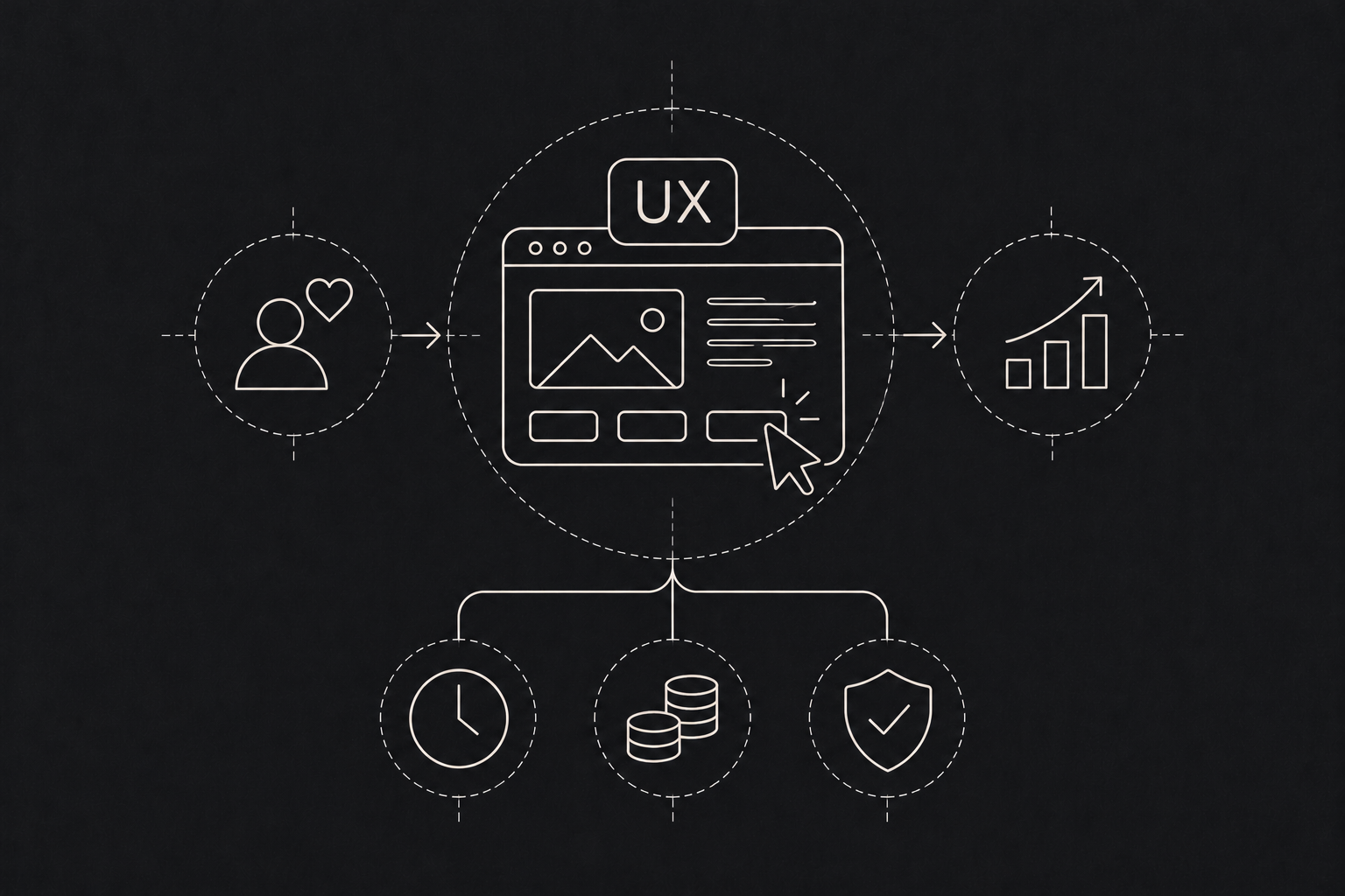
UX design often gets treated as the nice extra you add once the real work is done. Make it look good, round the corners, pick a better font. That view misses the point, and it costs businesses money every day. The numbers back this up. McKinsey tracked the design practices of 300 listed companies over five years and found that the top performers on its Design Index achieved 32 percentage points higher revenue growth than their industry peers.
Good UX is not about how a product looks. It is about how easily people get done what they came to do. And when people get things done easily, a lot of costs quietly go down. The Nielsen Norman Group describes usability in simple terms: how easy something is to learn, how efficiently people can use it, and how often they make mistakes.
Five ways UX pays back
- 01
More sign ups
Fewer drop offs.
- 02
Fewer tickets
Less support.
- 03
Less rework
Build it right once.
- 04
Faster training
Staff become productive sooner.
- 05
Loyal users
People stay.
Where the return shows up
More people finish what they start. Every confusing step in a signup, a checkout or an application form loses someone. Fix the confusing step and more people make it to the end. For a business, that is more customers from the same traffic, without spending more on ads.
Fewer support calls. When users cannot find something or do not understand an error message, they contact you. Each of those conversations costs staff time. Clearer design means fewer questions, and your support team can focus on the problems that actually need a person.
Less rework for developers. Fixing a flow in a design file takes hours. Fixing it after it is built, tested and live takes days or weeks. Doing the UX work first means developers build the right thing once. Faster training for internal tools. If your staff use internal software, every unclear screen adds to onboarding time and mistakes. A well designed internal tool gets new hires productive sooner and cuts down on data entry errors.
People stay. Products that are easy to use get used more. Customers who find your app frustrating will try a competitor the moment one appears.
What good UX work actually involves
It is less about artistic flair and more about method:
- Understanding users. Who are they, what device are they on, how is their connection, how comfortable are they with technology?
- Mapping the journey. Every step from first visit to finished task, looking for friction.
- Testing early. Putting rough prototypes in front of real users and watching where they get stuck.
- Designing for real conditions. Small screens, slow networks, bright sunlight, people in a hurry.
- Designing for everyone. Readable text, good contrast and clear labels help every user, not only those with disabilities. The Web Content Accessibility Guidelines are the standard reference.
- Measuring. Tracking where users drop off so improvements are based on evidence, not opinion. How to measure the payoff yourself
Pick a few numbers before you change anything. How many people start the signup, and how many finish? How many support tickets mention a specific feature? How long does it take a new employee to complete a common task in your internal system?
Make the design change. Give it enough time to collect real data. Measure again. That is your return, in your own numbers, rather than a figure from someone else's study.
Small fixes count
You do not always need a full redesign. Often the biggest wins come from fixing a handful of specific problems: a confusing button label, a form that asks for too much, an error message that does not explain what went wrong. A focused UX review can find these quickly.
Where to start if your budget is tight
Begin with the journey that matters most to your revenue, usually signup, checkout or the first task a new user tries. Watch five people attempt it, in person or over a video call, without helping them. Write down every place they pause, guess or give up. Fix the worst three issues, then measure again. This kind of focused review costs little, and it often reveals problems the team stopped noticing long ago.